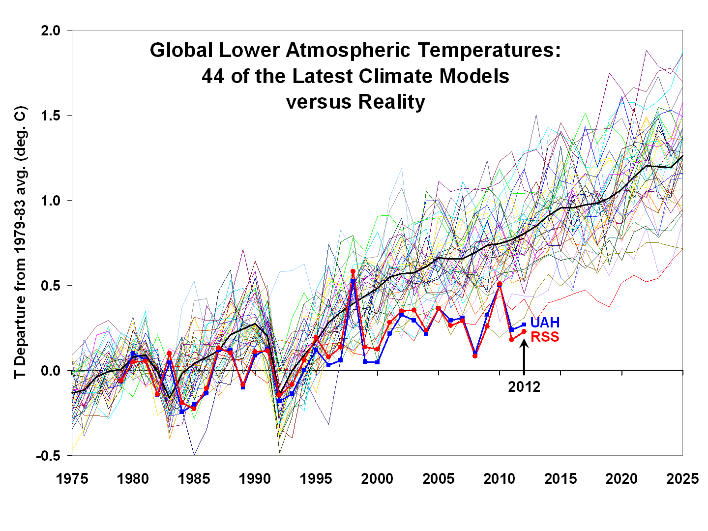
Yeah, I know where you got the graph, that's why I said Spencer and Christy. But the text does not specify the models used or the scenarios. This strikes me as the very lack of transparency complained of above. All he says are that they 'approximately represent' the models used by the IPCC.
Why did he not show the actual IPCC models, I wonder?
-
Global Warming Slowdown: The View from Space « Roy Spencer, PhDOriginally posted by pjclarke View Post
Voila....
As you can see not looking good for the models.

Leave a comment:
-
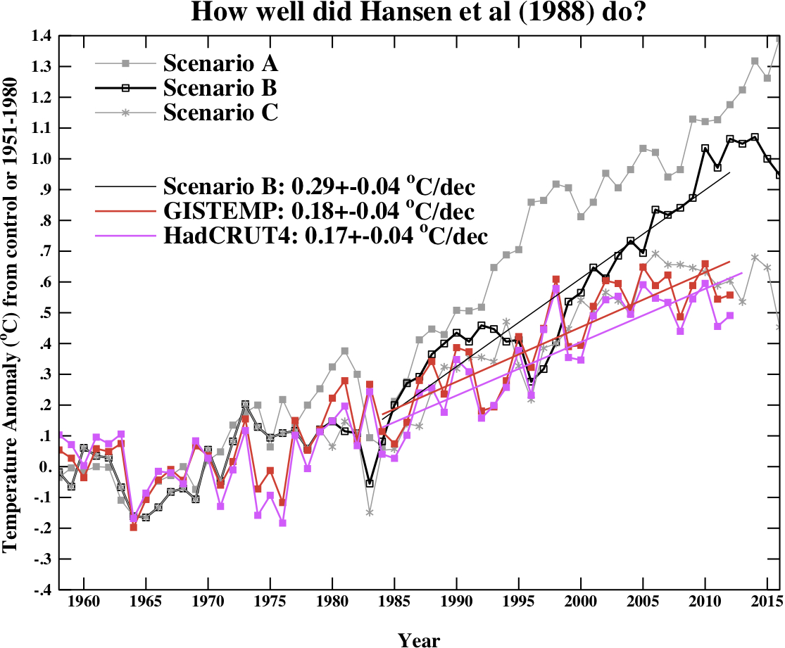
And bang goes the theory that climate scientists hide adverse results. I invite you to re-read what I wrote about Hansen 1988. As I said, the physics in the 1988 model have since been improved, up to date models have a lower sensitivity. The fact that the 1988 model is now running hot is evidence that the lower figure is accurate, and the text in the article shows that the IPCC CIMP3 models for the same period get the trend right to within uncertainty bounds ...
What do we learn from James Hansen's 1988 prediction?
Any joy in tracking down which models and scenario were plotted in the graph you shared?
Last edited by pjclarke; 11 January 2014, 17:43.Leave a comment:
-
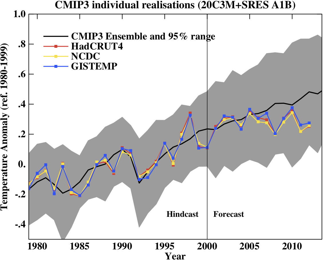
An update to your previous graph comparing against Hansen's predictions:
By posting the link you've scored an own goal because it's a continuation of the exact same graph you posted which looked gr8 in 2005 but shows how wrong the prediction is in 2012.
Last edited by BlasterBates; 11 January 2014, 13:33.Leave a comment:
-
Well, thanks in return, but without knowing which models are being plotted, and for which scenario the comparison is meaningless. Can you tell us? I'm sure Christy and Spencer would never cherry-pick the warmest models, with no uncertainty and the coolest observations to make a bogus point now would they?
Quark Soup by David Appell: Speaking of "Epic Fails"
Not had much joy in the past but hope springs eternal, which models, and which scenario BB?Last edited by pjclarke; 11 January 2014, 12:20.Leave a comment:
-
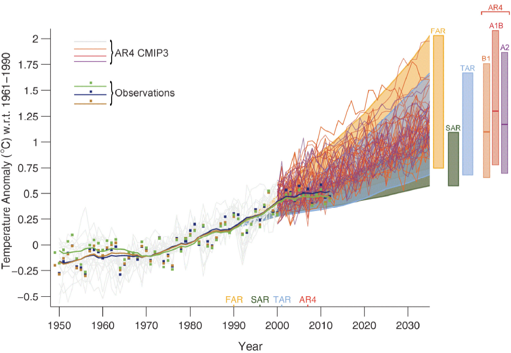
Thanks pj though I noticed that it is somewhat out of date, by around 8 or 9 years. Time marches on so lets look how the comparison has panned out in the intervening years.
Have a nice weekend Last edited by BlasterBates; 10 January 2014, 17:33.
Leave a comment:
-
<Sigh> They will all prove to be 'wrong' in the long term, barring a miraculous coincidence. Nobody knows how greenhouse gas concentrations will evolve and so they are run for various scenarios. Ensembles of these runs are the averaged together, and published with a confidence interval. A common trick amongst the fake sceptics is to just compare the most extreme scenario with obervations to show the models are too 'hot'.
Your example would be better phrased as 'I think Rolls Royce will be in the range x to y in 2020 years, with 95% certainty. If you're asking my opinion I think scenario RCP6.5 is most likely.
Also, the models are physics-based and so are changed as our understanding of the climate physics changes. For example the model used by Hansen for his 1988 projections had a property that a doubling of CO2 resulted in a rise of around 4C, more recent models put it nearer 3C. This has a small effect in the early years but will means the model will overstimate after a couple decades. But he didn't do too bad ...

Leave a comment:
-
which ones are wrong then ?Originally posted by pjclarke View PostLeave a comment:
-
Travesty.What I cant accept, is when a third person comes along (pj) and claims they are BOTH 100% accurate
There, I engaged.Leave a comment:
-
I am certainly not going to defend every example of bad phrasing, joke, irony or hyperbole in stolen private correspondence, however it is the case that the temperature series Jones curates can be fully reproduced from publicly available data. It is also the case that McIntyre, one of the 'M's orchestrated a campaign of frivolous FOI requests, 60 in one 5 day period, all of which must be responded to.
Add in some gratuitous rudeness on McIntyre's website about Jones and colleagues and it is not really surprising if they occasionally used intemperate language in private.
Another question goes unanswered.Leave a comment:
-
ok. i widen my reading to include phil jonesOriginally posted by pjclarke View Post
“The two MMs have been after the CRU station data for years. If they ever hear there is a Freedom of Information Act now in the UK, I think I’ll delete the file rather than send to anyone”.Leave a comment:
-
Piffle.One of the hallmarks of climate science is the refusal of climate scientists to let others see their workings.
Name one result underlying the concensus that is not based on hundreds of peer-reviewed studies. You can't, any more than you could provide evidence to support your accusation of dishonesty and data manipulation.
You need to widen your reading beyond Watts, Goddard and McIntyre, my friend. The science is not strong because of the concensus, the consensus is strong because of the science.Leave a comment:
-
if a financial advisor came to me and said 'shares in rolls royce will be x in 2020. trust me , my models is 100% accurate'
then a second financial advisor came to me and said 'shares in rolls royce will be y in 2020. trust me , my models is 100% accurate'
I could accept that. they both think they are right.
What I cant accept, is when a third person comes along (pj) and claims they are BOTH 100% accurate
mind numbingLeave a comment:
-
Can I just point out that the graph in BB's link is from the Second Order Draft of the IPCC report, marked in block letters as a temporary placeholder, contained errors which when corrected change the picture more than somewhat, without being accused of oh, 'not engaging' or not being scientific or something or other? The finished version looks like
Leave a comment:
Leave a comment: