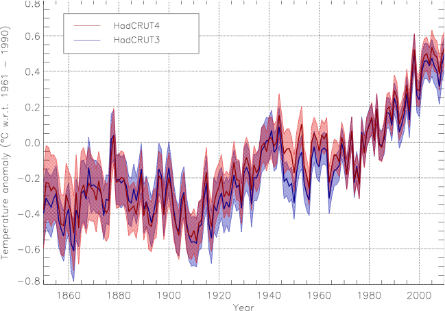
Well, if you go back as far as 1880, the uncertainties become pretty large
so not that surprising that there are discrepencies between datasets that far back. Human influencies on the climate only really became significant in the first half of the 20th Century and only became dominant after about 1950, so this is all a bit academic....
But c'mon Mr Bates, why so coy? So we know what we're discussing, what is the source of the data in your first graph? Surely you know ?
- Visitors can check out the Forum FAQ by clicking this link. You have to register before you can post: click the REGISTER link above to proceed. To start viewing messages, select the forum that you want to visit from the selection below. View our Forum Privacy Policy.
- Want to receive the latest contracting news and advice straight to your inbox? Sign up to the ContractorUK newsletter here. Every sign up will also be entered into a draw to WIN £100 Amazon vouchers!
Reply to: 2013 Bad year for Global warming
Collapse
You are not logged in or you do not have permission to access this page. This could be due to one of several reasons:
- You are not logged in. If you are already registered, fill in the form below to log in, or follow the "Sign Up" link to register a new account.
- You may not have sufficient privileges to access this page. Are you trying to edit someone else's post, access administrative features or some other privileged system?
- If you are trying to post, the administrator may have disabled your account, or it may be awaiting activation.
Logging in...
Previously on "2013 Bad year for Global warming"
Collapse
-
Originally posted by pjclarke View PostThe lack of any links to sources? Graphs of the Northern Hemisphere being described three times as 'global'
I'm sure you verified the accuracy of the comparison, rather than just uncritically cutting and pasting from the website of climate comedian Stephen Goddard.
Going back to anomalies and baselines, the second graph is from the Hadley Centre who use the period 1961-1990 as their baseline. As the first graph is from a US NAS report dated 1975, they cannot possibly have the same baseline so once again: comparing apples & oranges.
You also have to know what data are being plotted, what smoothing was done, etc. Do you know what data are actually being plotted in graph 1? I do, but I didn't post the graph, or make any accusations of data fiddling, and its too near Christmas to be spoon-feeding trolling muppets. Hint: Budyko (1968).
Be sure to share the answer if and when you find it (yeah, I know, but I'm an optimist at heart). Another hint: I wouldn't rely on Goddard, he lost the gig at WUWT for being publicly and serially wrong, now that takes some doing.
US NAS report dated 1975, they cannot possibly have the same baseline so once again
Last edited by BlasterBates; 23 December 2013, 20:52.
Leave a comment:
-
Notice anything?
I'm sure you verified the accuracy of the comparison, rather than just uncritically cutting and pasting from the website of climate comedian Stephen Goddard.
Going back to anomalies and baselines, the second graph is from the Hadley Centre who use the period 1961-1990 as their baseline. As the first graph is from a US NAS report dated 1975, they cannot possibly have the same baseline so once again: comparing apples & oranges.
You also have to know what data are being plotted, what smoothing was done, etc. Do you know what data are actually being plotted in graph 1? I do, but I didn't post the graph, or make any accusations of data fiddling, and its too near Christmas to be spoon-feeding trolling muppets. Hint: Budyko (1968).
Be sure to share the answer if and when you find it (yeah, I know, but I'm an optimist at heart). Another hint: I wouldn't rely on Goddard, he lost the gig at WUWT for being publicly and serially wrong, now that takes some doing.Last edited by pjclarke; 23 December 2013, 19:15.
Leave a comment:
-
no way.
you seem to be saying that they are fiddling the data.
Leave a comment:
-
This is how the global temperatures looked in 1975.
now note global temps increased from 0.4 degrees negative anomoly to 0.6 in 1940
Note the global temperature graph now:
Notice anything?
Like the disappearance of the 1940 0.6 warm anomaly?
Leave a comment:
-
nasa giss predicts an ice age
nasa giss predicts global warming
more like that kind of fact. a fact for every occasion
Leave a comment:
-
different, results, different interpretations, different forecasts.
a fact for every occasion
Leave a comment:
-
my point exactly.
different, results, different interpretations, different forecasts.
a fact for every occasion
'Oh priest, why are we SO punished ' - CAGW high priest - 'tis the will of CO2'
'Oh priest, why are we SO bountifulled ' - CAGW high priest - 'tis the will of CO2'
Leave a comment:
-
every single data point is either going in opposite directions, or is over .2 degrees different
which represents a whole decade of your fantasy warming
The two datasets have different coverage and methodological choices, so are not going to be in lockstep every single month, over the long term... well
Leave a comment:
-
I think the only reason these muppets think we get global warming is because the friction heat generated from their ham shandies is upsetting all the measurements.
Leave a comment:
-
Originally posted by pjclarke View PostDamn, I missed that. I only saw one in which this November was the warmest on the record, and another in which it was 'only' the third warmest, a difference less than one tenth the uncertainty in an individual measurement .....
every single data point is either going in opposite directions, or is over .2 degrees different
which represents a whole decade of your fantasy warming
Leave a comment:
-
now BB has highlighted two diametrically opposed temperature records for this year.
Leave a comment:
-
Exactly Windfarms are monuments to a new religion, there is a vociferous minority who feel better because they're there, even though they do nothing to reduce CO2 emissions.
It's part of human nature to build things which have no utility other than to satisfy people's beliefs.
In a long distant future I can imagine archeologists puzzling over wind turbines and wondering what purpose they served, in the same way that they do over stone henge.
Leave a comment:
-
Originally posted by EternalOptimist View PostThe catastrophists are well known for producing a spaghetti of papers that prove everything is due to CO2 and to humans.
Whatever happens, hot, cold, drought, floods, more tornados , less tornados, more bush fires, less bush fires, more mosquitos , less mosquitos, lions roaming in England, Polar bears roaming England, more snow, less snow
there will be a paper to support it.
now BB has highlighted two diametrically opposed temperature records for this year.
which one to believe ? which ever one fits their argument of the moment, i guess
It all depends on what type of statue you want your money spent on...
Leave a comment:
- Home
- News & Features
- First Timers
- IR35 / S660 / BN66
- Employee Benefit Trusts
- Agency Workers Regulations
- MSC Legislation
- Limited Companies
- Dividends
- Umbrella Company
- VAT / Flat Rate VAT
- Job News & Guides
- Money News & Guides
- Guide to Contracts
- Successful Contracting
- Contracting Overseas
- Contractor Calculators
- MVL
- Contractor Expenses
Advertisers
Contractor Services
CUK News
- Spot the hidden contractor Yesterday 10:43
- Accounting for Contractors Dec 19 15:30
- Chartered Accountants with MarchMutual Dec 19 15:05
- Chartered Accountants with March Mutual Dec 19 15:05
- Chartered Accountants Dec 19 15:05
- Unfairly barred from contracting? Petrofac just paid the price Dec 19 09:43
- An IR35 case law look back: contractor must-knows for 2025-26 Dec 18 09:30
- A contractor’s Autumn Budget financial review Dec 17 10:59
- Why limited company working could be back in vogue in 2025 Dec 16 09:45
- Expert Accounting for Contractors: Trusted by thousands Dec 12 14:47
Leave a comment: