• Visitors can check out the Forum FAQ by clicking this link. You have to register before you can post: click the REGISTER link above to proceed. To start viewing messages, select the forum that you want to visit from the selection below. View our Forum Privacy Policy.
  • Want to receive the latest contracting news and advice straight to your inbox? Sign up to the ContractorUK newsletter here. Every sign up will also be entered into a draw to WIN £100 Amazon vouchers!

You are not logged in or you do not have permission to access this page. This could be due to one of several reasons:

  • You are not logged in. If you are already registered, fill in the form below to log in, or follow the "Sign Up" link to register a new account.
  • You may not have sufficient privileges to access this page. Are you trying to edit someone else's post, access administrative features or some other privileged system?
  • If you are trying to post, the administrator may have disabled your account, or it may be awaiting activation.

Previously on "Climate change propaganda is simply a ruse for a socialist agenda"

Collapse

  • pjclarke
    replied
    Originally posted by BlasterBates View Post
    Do apologise..but doesn't really change anything, it looked very similar to the graph I was looking for:


    The fact is the emissions scenario is A.....business as usual, exponential increase in CO2 emissions.

    Hansen got it wrong......he made his prediction and nothing has turned out as he said it would.

    We haven't curbed CO2 as he said we should, we didn't listen to him and the world hasn't heated like he predicted, he's wrong.
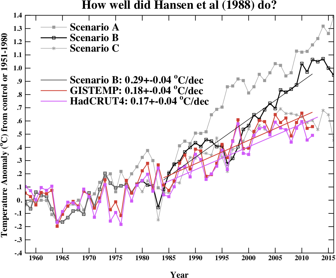
    It is an improvement, but you've only included CO2, excluded other gases such as the CFCs and methane. If you include all forcings the comparison looks like this:


    That is, reality tracked somewhere below Scenario B. Its true that the 1988 model is now obsolete and more recent models, if you used them to hindcast, would get a much closer projection. Still, we're a long way from 'nothing to worry about'.

    Leave a comment:


  • BlasterBates
    replied
    Originally posted by pjclarke View Post
    Do you really not comprehend the word 'cumulative'?
    Do apologise..but doesn't really change anything, it looked very similar to the graph I was looking for:


    The fact is the emissions scenario is A.....business as usual, exponential increase in CO2 emissions.

    Hansen got it wrong......he made his prediction and nothing has turned out as he said it would.

    We haven't curbed CO2 as he said we should, we didn't listen to him and the world hasn't heated like he predicted, he's wrong.
    Last edited by BlasterBates; 5 May 2015, 20:23.

    Leave a comment:


  • pjclarke
    replied
    Originally posted by BlasterBates View Post
    Take your pick, scenario A is completely wrong, scenario B the one you chose is also completely wrong, I suppose you can take solace in that it's only way out instead of being completely way out

    Scenario C was the one where there would be serious curtailment of CO2 output, that's the one where temperature stops rising, and guess what, even that one is out, too high

    His prediction was that if we continued as we are that would be scenario A not B. B is a linear increase in CO2 emissions

    Is this linear?

    No

    A wrong prediction is a wrong prediction.

    His prediction was a ridiculous as the prediction about an Ozone hole causing millions of deaths.
    Ah, more quality scepticism. So, you agree your original one-scenario graph was BS. That's a step forward, good. Now, here's the original graphic from 2013 before Ira Glickstein vomited all over it.


    and comment

    Finally, we update the Hansen et al (1988) comparisons. Note that the old GISS model had a climate sensitivity that was a little higher (4.2ºC for a doubling of CO2) than the best estimate (~3ºC) and as stated in previous years, the actual forcings that occurred are not the same as those used in the different scenarios. We noted in 2007, that Scenario B was running a little high compared with the forcings growth (by about 10%) using estimated forcings up to 2003 (Scenario A was significantly higher, and Scenario C was lower), and we see no need to amend that conclusion now.
    What I would really, really like to know is where Glickstein got his 0.22C 'Actual' from? That' s around 0.09C/decade, half the trend actually stated for even the lowest index. The actual number for GISTEMP would be around 0.41C. His numbers for the scenarios look equally kooky but I really can't be bothered to check his homework, if anyone does the numbers are here:

    http://www.realclimate.org/data/scen_ABC_temp.data

    His prediction was that if we continued as we are that would be scenario A not B. B is a linear increase in CO2 emissions
    RTFR

    "These scenarios are designed to yield sensitivity experiments for a broad range of future greenhouse forcings. Scenario A, since it is exponential, must eventually be on the high side of reality in view of finite resource constraints and environmental concerns, even though the growth of emissions in scenario A (~1.5%/yr) is less than the rate typical of the past century (~4%/yr). Scenario C is a more drastic curtailment of emissions than has generally been imagined; it represents elimination of cholorfluorocarbon emissions by 2000 and reduction of CO2 and other trace gas emissions to a level such that the annual growth rates are zero (i.e. the sources just balance the sinks) by the year 2000. Scenario B is perhaps the most plausible of the three cases
    ."

    Is this linear?
    Do you really not comprehend the word 'cumulative'?

    Leave a comment:


  • BlasterBates
    replied
    Originally posted by pjclarke View Post
    Maybe later, if you're good, but for now, I would just like to know why, when Hansen published 3 scenarios, you showed a graph that only plotted one, and which dataset you are using for 'Actual'?

    It is accepted that Hansen's 1988 middle (Scenario B) projection performed well for the first 20 years or so, but is now an overestimate. This is because the fairly early model he was using had a higher climate sensitivity than the value we've derived in the intervening decades (around 4C then, lowered to around 3C now.)

    Update - In 1988 James Hansen published three (3) projections, based on three (3) different scenarios. These were:

    A - Exponential growth. Described as 'on the high side of reality'
    B - BAU, described as perhaps the most plausible
    C- Emissions controlled after 2000.

    BB's graph only plots one (1) scenario, the most extreme and labels it as 'the' prediction (A tactic also much abused by Christopher Monckton btw).

    Naughty boy.


    Take your pick, scenario A is completely wrong, scenario B the one you chose is also completely wrong, I suppose you can take solace in that it's only way out instead of being completely way out

    Scenario C was the one where there would be serious curtailment of CO2 output, that's the one where temperature stops rising, and guess what, even that one is out, too high

    His prediction was that if we continued as we are that would be scenario A not B. B is a linear increase in CO2 emissions

    Is this linear?


    No

    A wrong prediction is a wrong prediction.

    His prediction was a ridiculous as the prediction about an Ozone hole causing millions of deaths.
    Last edited by BlasterBates; 5 May 2015, 18:15.

    Leave a comment:


  • pjclarke
    replied
    Originally posted by BlasterBates View Post
    I would like to make a prediction:

    pjclarke is about to post a graph showing how the scientists prediction were actually accurate.
    Maybe later, if you're good, but for now, I would just like to know why, when Hansen published 3 scenarios, you showed a graph that only plotted one, and which dataset you are using for 'Actual'?

    It is accepted that Hansen's 1988 middle (Scenario B) projection performed well for the first 20 years or so, but is now an overestimate. This is because the fairly early model he was using had a higher climate sensitivity than the value we've derived in the intervening decades (around 4C then, lowered to around 3C now.)

    Update - In 1988 James Hansen published three (3) projections, based on three (3) different scenarios. These were:

    A - Exponential growth. Described as 'on the high side of reality'
    B - BAU, described as perhaps the most plausible
    C- Emissions controlled after 2000.

    BB's graph only plots one (1) scenario, the most extreme and labels it as 'the' prediction (A tactic also much abused by Christopher Monckton btw).

    Naughty boy.
    Last edited by pjclarke; 5 May 2015, 15:39.

    Leave a comment:


  • pjclarke
    replied
    Originally posted by BlasterBates View Post
    No need, just note that scientists sometimes get it wrong

    Which of Hansen's 3 scenarios there is being plotted against which of the 4 global datasets?

    What do we learn from James Hansen's 1988 prediction?

    Leave a comment:


  • BlasterBates
    replied
    I would like to make a prediction:

    pjclarke is about to post a graph showing how the scientists prediction were actually accurate.

    Leave a comment:


  • BlasterBates
    replied
    Originally posted by pjclarke View Post
    Good point. Perhaps some political think tank should launch an 'investigation'.
    No need, just note that scientists sometimes get it wrong

    Leave a comment:


  • pjclarke
    replied
    Originally posted by BlasterBates View Post
    Well done and thanks for repeating the sentence I've already read, but the scientists way back when didn't mention this, did they....

    ...and what other causes are there?
    Good point. Perhaps some political think tank should launch an 'investigation'.

    Leave a comment:


  • BlasterBates
    replied
    Originally posted by pjclarke View Post
    Do you actually read the links you post ??

    A NASA-led study has documented an unprecedented depletion of Earth's protective ozone layer above the Arctic last winter and spring caused by an unusually prolonged period of extremely low temperatures in the stratosphere

    Well done and thanks for repeating the sentence I've already read, but the scientists way back when didn't mention this, did they....

    ...and what other causes are there?

    Leave a comment:


  • pjclarke
    replied
    Originally posted by BlasterBates View Post
    Unprecedented Ozone depletion in 2011

    And what does that show ?

    That there must be something else other than CFC's that the scientists didn't mention or know.

    If the ozone suddenly depletes without explanation well after CFC's were banned that means the scientists missed something pretty major in their theory.

    That's science for "they don't really have a clue".
    Do you actually read the links you post ??

    A NASA-led study has documented an unprecedented depletion of Earth's protective ozone layer above the Arctic last winter and spring caused by an unusually prolonged period of extremely low temperatures in the stratosphere

    Leave a comment:


  • original PM
    replied
    Originally posted by pjclarke View Post
    I guess you wait until you're just about to hit the wall before applying the brakes?

    Stern report: the key points | Politics | The Guardian
    Climate change 'kills 300,000 every year' - Telegraph
    Nah I apply the brakes in plenty of time.

    What I do not do is refuse to get in the car in case we crash.....

    Leave a comment:


  • BlasterBates
    replied
    Unprecedented Ozone depletion in 2011

    And what does that show ?

    That there must be something else other than CFC's that the scientists didn't mention or know.

    If the ozone suddenly depletes without explanation well after CFC's were banned that means the scientists missed something pretty major in their theory.

    That's science for "they don't really have a clue".

    Leave a comment:


  • pjclarke
    replied
    Originally posted by BlasterBates View Post
    That's one of those "scientific assertions" that will never be tested.

    As I say no harm in this case in being "paranoid", but strongly suspect that the scientists don't have a clue.
    In the Blue Corner: Molina, Crutzen and Rowland. Awarded the 1995 Nobel prize in Chemistry for their work on Ozone decomposition. In the Red Corner Blaster 'scientists don't know nuffink' Bates ....

    Just Wow.

    Leave a comment:


  • BlasterBates
    replied
    Originally posted by pjclarke View Post
    ...
    That's one of those "scientific assertions" that will never be tested.

    As I say no harm in this case in being "paranoid", but strongly suspect that the scientists don't have a clue.

    Leave a comment:

Working...
X