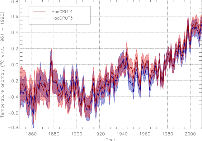
Notice anything?

I'm sure you verified the accuracy of the comparison, rather than just uncritically cutting and pasting from the website of climate comedian Stephen Goddard.
Going back to anomalies and baselines, the second graph is from the Hadley Centre who use the period 1961-1990 as their baseline. As the first graph is from a US NAS report dated 1975, they cannot possibly have the same baseline so once again: comparing apples & oranges.
You also have to know what data are being plotted, what smoothing was done, etc. Do you know what data are actually being plotted in graph 1? I do, but I didn't post the graph, or make any accusations of data fiddling, and its too near Christmas to be spoon-feeding trolling muppets. Hint: Budyko (1968).
Be sure to share the answer if and when you find it (yeah, I know, but I'm an optimist at heart). Another hint: I wouldn't rely on Goddard, he lost the gig at WUWT for being publicly and serially wrong, now that takes some doing.


Comment