Visitors can check out the Forum FAQ by clicking this link. You have to register before you can post: click the REGISTER link above to proceed. To start viewing messages, select the forum that you want to visit from the selection below. View our Forum Privacy Policy.
Want to receive the latest contracting news and advice straight to your inbox? Sign up to the ContractorUK newsletter here. Every sign up will also be entered into a draw to WIN £100 Amazon vouchers!
I just want my fckng lightbulbs back youse bastids
Stop beating around the bush EO. We know you're old enough, but just leave it man. It's not anyone's fault your prime beach front house is now under 3km of Antarctic ice and you couldn't get your mammoth to the vets because of the poor road maintenance by the 30000bc Tory party!
And what's causing the rise? In small words please.
in order of liklihood, with degree of certainty
1. interglacial recovery - fact
2. solar activity - v probbly
....
..
..
91. part of it due to man - an interesting theory, probbly a rounding error
..
..
1009. leprecauns - a supernatural explanation, see pjclarke for details
(\__/)
(>'.'<)
("")("") Born to Drink. Forced to Work
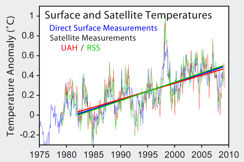
I don't normally get involved in these discussions, but that graph is bulltulip. It is the sort of bollocks I see in the workplace all the time to make Directors go "Ooh, pretty, we like, we approve, we sign your business case".
Clue 1: The vertical axis is "anomaly" but there is no explanation of what the "irregularity" being calculated is. So the vertical axis is "someone's interpretation of some deviation from something but we're not saying what". It could be the deviation from what the sea temperature might be if there were more pirates.
Clue 2: Start digging online and we discover all the figures have been adjusted, and more than once. One time for "oops, seasonal things" and another for "an error, we've fixed it so it matches ground based things". So, the raw data has been buggered with in an undocumented way to make it match the desired results.
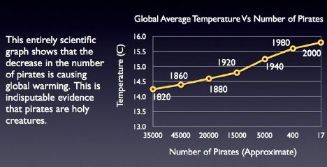
And it makes just as much sense as the rest of the body of global warming 'data', and the correlation between the data and the derived 'conclusion' is much clearer with the pirates theory.
1. interglacial recovery - fact
2. solar activity - v probbly
....
..
..
91. part of it due to man - an interesting theory, probbly a rounding error
..
.. 1009. leprecauns - a supernatural explanation, see pjclarke for details
Coincidentally, I've noticed a correlation between the fortunes of Manchester United and global warming. It warmed a bit as Man Utd won trophies in the fifties and sixties, cooled among predictions of a new ice age as they were relegated in the seventies, and then warmed again as Ferguson weaved his magic.
My theory is that the warming is due to all the billions of Man Utd fans around the world releasing energy in celebration when Man Utd win games. Obviously none of them live in Manchester itself, which is why it's always cold and wet there.
Irrefutable.
Last edited by Doggy Styles; 12 February 2011, 09:04.
")


Comment